Afraid of colour
Why are we, as a society, so afraid of colour? The recent Pantone Colour of the Year, white, or ‘Cloud Dancer,’ has sparked this reflection.
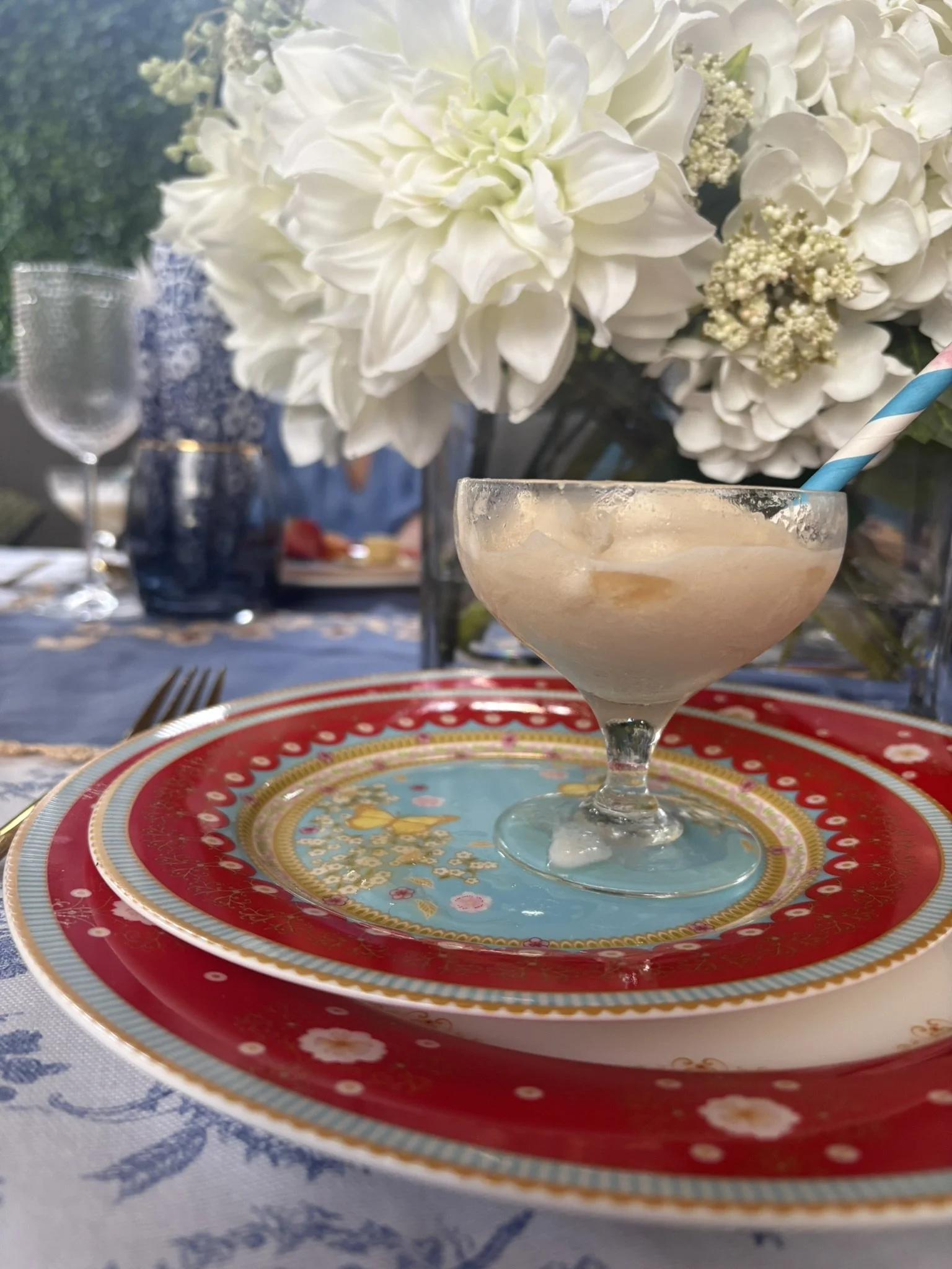
My favourite dinner set, Maxwell and Williams Cashmere Enchante, in the colourway Veronique. I love the vibrant colours; they lift my mood whenever I see it.
This phenomenon has piqued my curiosity for a while now. I was often caught up in slow moving traffic in my daily commute to work in the CBD, so as a way to pass the time and diffuse my sense of frustration, I would look around me to spot cars in the colours of the spectrum, you know, the good old Roy G Biv. It has become harder and harder to complete this little personal challenge over the years.
Cars now tend to come in a very narrow palette of white, silver, black, blue and red. I am sure there’s a lot of psychology behind this, and obviously, consumer behaviour and preferences are driving this too, but I remember the roads of the 1970s and 1980s resembling a box of Smarties; greens, browns, yellows, reds, oranges, blues. From my grandfather’s chocolate brown Datsun 200B with a gear stick that made a small sound every time he changed gear to my very first car, Max, the Morris Minor, an intense canary yellow, colour was splashed across all lanes on the road, and carparks looked like a patchwork quilt with cars of all different colours parked in random patterns.
After Max, I bought another yellow car, a disastrous VW Passat, a purchase made because the young man I yearned after suggested I buy it. We live and learn, both about young men, and cars. After that was my red Ford Laser, named Rupert, and a dark blue Hyundai Excel, Wij. I am the proud owner of a day-glo orange car now. My heart lifts a little when I see it, an emblem of who I am in a way and that is someone who loves colour.
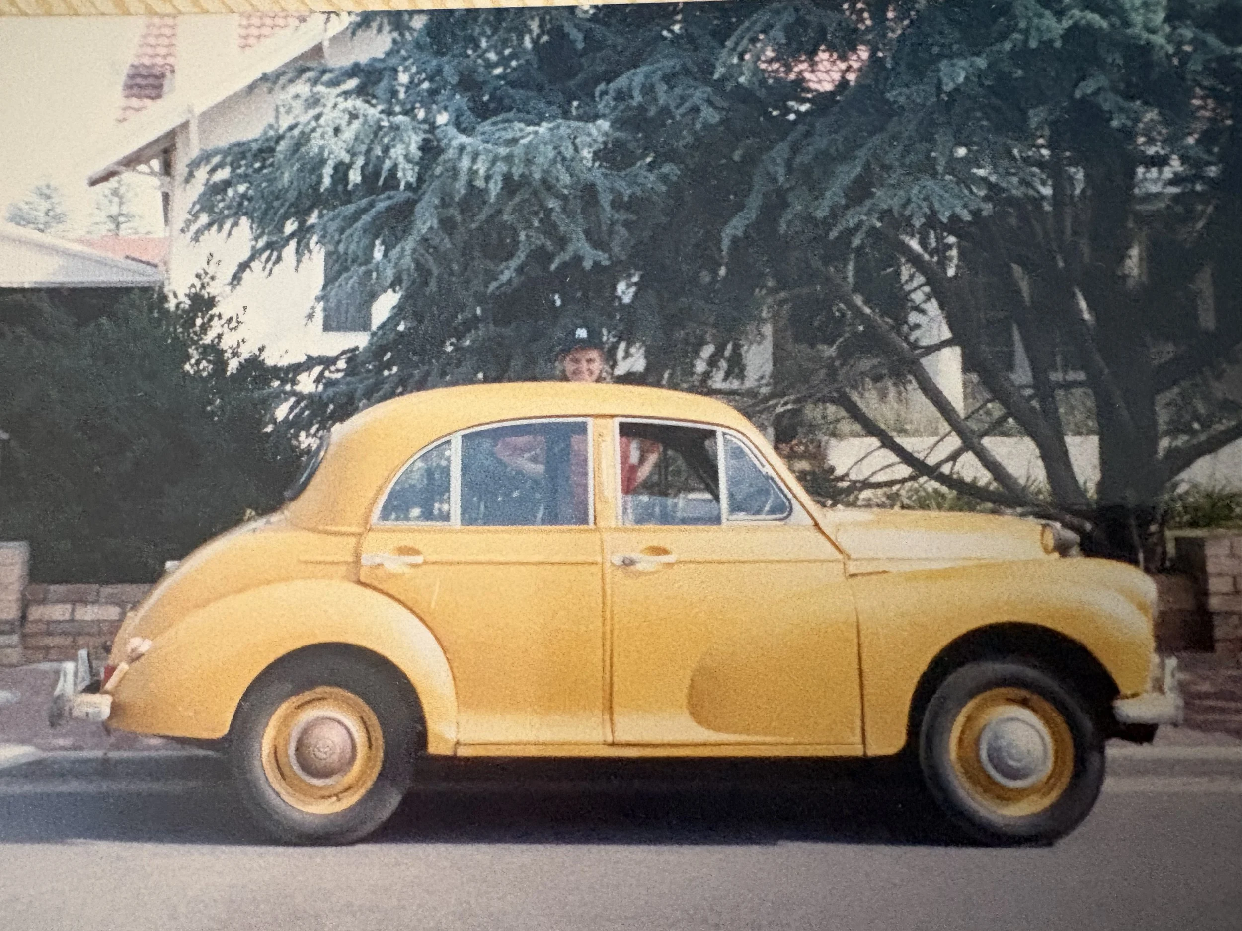
My first car, a 1954 Morris Minor, “Max”. It was an ill advised purchase in retrospect, but most first vehicles are.
I have taken a detour because the point of all of this is, we are playing it safe. Now that so much is open to public scrutiny via social media we have tended to make ourselves smaller, blander, not willing to stand out too much from the crowd in case we attract censure, or even worse, ridicule.
Another reason could be that people conflate the sleek, monochrome look with luxury and wealth, whereas for me at least, that screams hospital and institutions. However, it is a very popular look and has been for quite a while now, and popularity drives the algorithms, so of course more people subscribe to it. It can be done beautifully, but the term “sad beige baby” has been coined for a reason and the sleek, bland modern aesthetic leaves me feeling cold, joyless, sanitised.
My favourite set of dinner plates are no shrinking violets, they are fiercely red and white, with touches of sky blue, blush pink and gold. My heart sings when I see them, as they, for me, are a mad riot in the sea of pristine curation.
I need colour and pattern. I like things that tell a story either about the person they belong to, or the occasion that they are at, or the tradition they are a part of. Don’t get me wrong, I love colour, but it needs to be intentional, and yes, despite what I have just said about the careful curation of modern life, for me at least, there does need to be some thought between in the colours and styles that I choose.
I want beauty, and order (sounds like I have a touch of the Lord Farquaad’s about me doesn’t it), but I also do like an element of playfulness, whimsy, and the unexpected. Monochrome is too easy, and oh boy, I don’t seem to do easy in life.
Where do you sit on the sleek modern or the riotous colour scale?